
How a Smarter UX/UI Strategy Can Transform Your Business Results
Let’s be honest — most people think a website redesign is about making things look prettier. New colors, a fresh logo, maybe some cool animations. And while aesthetics absolutely matter, they’re not the point. The real goal of a website redesign is revenue. Engagement. Conversions. Business growth.
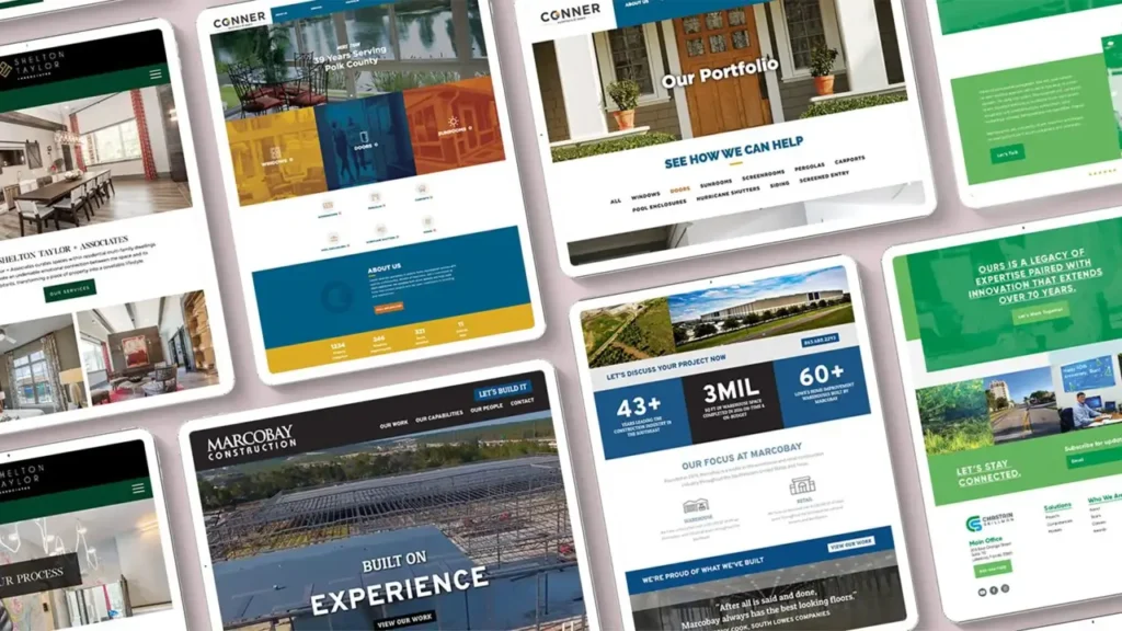
In this post, we’re walking you through a real-world website redesign case study — from the initial audit all the way through to the final metrics. You’ll see exactly what was broken, what we changed, and what happened to the numbers afterward. No fluff, no vague promises. Just honest before-and-after data and the lessons you can apply to your own website right now.
Whether you’re running an ecommerce store, a service business, or a personal brand, this guide will show you what a modern, strategic website redesign actually looks like in 2026.


Why Website Redesign Is a Business Decision, Not a Design Decision
Here’s a mindset shift that changes everything: your website is not a brochure. It’s a salesperson that works 24 hours a day, 7 days a week. And if that salesperson is confusing, slow, or hard to navigate, you’re losing money every single day.
According to data from the Nielsen Norman Group, users form an opinion about a website in roughly 50 milliseconds. That’s 0.05 seconds to make a first impression. If your layout is cluttered, your message is unclear, or your page loads slowly, visitors leave — and they rarely come back.
Research from Forrester found that a well-designed user interface can raise conversion rates by up to 200%, and a better UX design can yield conversion rates up to 400% higher. These aren’t small numbers. These are the kinds of improvements that transform a struggling business into a thriving one.
So when we talk about website redesign, we’re really talking about conversion rate optimization, user experience improvement, and ultimately — increasing website sales. The visual refresh is just the vehicle.
The Problem — Website Audit Before Redesign
Before any redesign work begins, you need to understand exactly what you’re dealing with. This is where the website audit comes in. Think of it as a full health check for your digital presence.
For this case study, we analyzed a live website and documented every friction point, every missed opportunity, and every UX failure we could find. Here’s what the audit revealed.
Cluttered Layout
The homepage was trying to do too much at once. There were multiple competing headlines, too many colors, overlapping sections, and no clear visual path for the user to follow. When everything is highlighted, nothing is. Users didn’t know where to look first, so most of them looked away.
Weak UX Structure
The information architecture — how content is organized and connected — was inconsistent. Users couldn’t predict where a link would take them. The navigation menu mixed high-priority pages with low-priority ones, giving no signal about what mattered most. Important pages were buried several clicks deep.
Low Engagement
The average session duration was under 45 seconds. The bounce rate was above 72%. Users were landing on the site and leaving almost immediately. This is a classic symptom of a disconnect between what the user expects and what the website delivers.
No Clear Value Proposition
The homepage didn’t answer the most basic question a visitor asks within the first few seconds: “What is this, and why should I care?” The headline was generic. The subheading was vague. There was no immediate reason to stay.
Missing Trust Signals
There were no testimonials above the fold, no visible reviews, no certifications or credentials, and no social proof of any kind. For a first-time visitor, the site gave them no reason to trust the business.
| Issue Found in Audit | Impact on User | Business Cost |
|---|---|---|
| Cluttered homepage layout | Confusion, no clear focus | High bounce rate |
| Poor navigation structure | Users get lost, leave frustrated | Low page depth, lost leads |
| No value proposition | No reason to stay | Immediate exits |
| Missing trust elements | Low confidence in brand | Low conversion rate |
| Mobile usability issues | Poor experience on phones | Lost mobile traffic |
UI/UX Audit — Digging Deeper Into the Experience
A basic website audit tells you what is broken. A proper UI/UX audit tells you why it’s broken — and more importantly, how to fix it. This is where we get into the details that most designers miss.
Poor Navigation Flow
We mapped out the full user journey using heatmaps and session recordings. What we found was telling: users were clicking on elements that weren’t clickable, ignoring elements that were, and consistently failing to find key pages like pricing, contact, and service details. The navigation was designed for the business, not for the user.
The fix is always the same: design navigation based on what users actually want to find, not what the company wants to show them. Card sorting exercises and user interviews help determine the right structure. In this case, we simplified the main menu to five clear categories and added a persistent CTA button in the header.
Lack of Visual Hierarchy
Visual hierarchy is about guiding the eye. It uses size, color, contrast, spacing, and positioning to tell users: this is the most important thing on this page, then this, then this. When visual hierarchy is absent, the page feels flat and overwhelming at the same time.
On the original site, body text and headlines were nearly the same size. CTAs blended into the background. Images were used decoratively rather than strategically. We restructured every page with a clear visual priority — headline first, supporting text second, social proof third, CTA last.
Mobile Usability Gaps
According to Statista, as of 2025, over 62% of all global web traffic comes from mobile devices. Yet the original website was clearly designed for desktop first and mobile as an afterthought. Buttons were too small to tap comfortably. Text was too small to read without zooming. Sections overlapped on smaller screens. The checkout process on mobile required excessive scrolling and had form fields that were difficult to fill out on a touchscreen.
Mobile usability isn’t optional in 2026. It’s the baseline.
Need a professional website or SEO optimization?
Visit our web development studio for custom websites, SEO services, and digital solutions.
Go to Andreev Web Studio →Goal Setting — What Does a Successful Redesign Look Like?
One of the most important steps in the redesign process — and one that’s often skipped — is defining what success actually means before you start. Without clear goals, you have no way to measure whether the redesign worked.
For this project, we set three primary goals backed by specific, measurable targets:
Goal 1: Increase Conversion Rate The baseline conversion rate was 1.2%. Our target was 1.6% — a 33% improvement. We defined “conversion” as a completed contact form submission or a direct product purchase.
Goal 2: Improve Session Duration Average session duration was 44 seconds. We wanted to push this above 65 seconds, indicating that users were actually engaging with the content rather than bouncing immediately.
Goal 3: Reduce Bounce Rate The bounce rate was sitting at 72.4%. Our target was to bring this below 55% — a meaningful drop that would signal improved relevance and engagement.
Secondary Goals:
- Improve Google PageSpeed score from 54 to above 85
- Increase pages per session from 1.3 to 2.0+
- Reduce cart abandonment rate by at least 15%
Having these numbers written down before the work began gave the whole team a shared definition of success. Every design decision, every copywriting choice, every technical optimization was evaluated against these goals.
The Redesign Process — UX/UI Improvements Step by Step
With the audit complete and goals defined, the actual redesign work began. Here’s how the process unfolded, phase by phase.
Phase 1: Information Architecture Redesign
We started with a complete restructuring of the site’s information architecture. This means mapping out every page, every section, and every user path — then rebuilding the structure from scratch based on user intent. We used a combination of competitor benchmarking, user persona development, and content hierarchy mapping.
The result was a cleaner, more logical site structure where every page had a clear purpose and a clear path to the next step.
Phase 2: Wireframing and Prototype
Before any visual design work began, we created low-fidelity wireframes for every key page. Wireframes strip away all the color, images, and styling — they’re just boxes and lines that show where content goes. This is where you solve layout problems without wasting time on polish.
Wireframes were tested with a small group of real users. Their feedback led to several changes before a single pixel of visual design was created.
Phase 3: Visual Design — Simplified and Modern
The new visual design followed several clear principles:
Simplicity over complexity. White space is not wasted space — it’s breathing room that helps users focus. The new design reduced visual noise by 60%, removing unnecessary elements and letting the important content shine.
Consistent typography system. We established a clear type hierarchy: one headline font, one body font, three size levels, two weight variations. Nothing more. This alone dramatically improved readability and professionalism.
Strategic use of color. The color palette was reduced to a primary brand color, one accent color, and neutral grays. Color was used intentionally — to highlight CTAs, to signal trust, and to create visual rhythm.
Phase 4: Copywriting Revisions
Design gets attention. Copy converts. We rewrote the headline and subheading for every key page, focusing on clarity, benefit-driven language, and a strong value proposition. The homepage headline went from a vague tagline to a specific, outcome-focused statement that immediately told visitors what they could achieve.
Phase 5: CTA Optimization
Every page had its CTA placement, wording, and design reviewed. We moved primary CTAs above the fold, made them visually distinct from surrounding content, and used action-oriented language (“Get Your Free Audit” vs “Contact Us”). Secondary CTAs were added at natural stopping points throughout longer pages.
Ecommerce Website Redesign — Special Considerations
For ecommerce specifically, there are additional layers of complexity that go beyond standard UX improvements. The goal isn’t just engagement — it’s purchase. Every friction point in the buying journey is a potential lost sale.
Product Page Optimization
Product pages were completely rebuilt. The new layout prioritized:
- Large, high-quality product images with zoom functionality
- Clear pricing with any discounts prominently displayed
- Short, scannable product descriptions with bullet points for key features
- Prominent “Add to Cart” button always visible without scrolling
- Customer reviews directly below the product details
- Related products shown at the bottom to encourage browsing
Streamlined Checkout Process
The original checkout was a four-step process. We reduced it to two steps by combining fields logically and removing unnecessary data collection. A guest checkout option was added — research from Baymard Institute consistently shows that forcing account creation is one of the top reasons for cart abandonment.
Progress indicators were added so users always knew how close they were to completing their purchase. Auto-fill was enabled for address fields. Payment options were expanded and displayed with recognizable logos.
Trust Elements Added
At every stage of the purchase journey, we added trust signals:
- SSL badge and secure payment icons at checkout
- Money-back guarantee statement near the CTA
- Real customer reviews with verified purchase labels
- Delivery time estimates clearly stated on product pages
- Easy returns policy linked prominently
| Ecommerce Element | Before Redesign | After Redesign |
|---|---|---|
| Checkout steps | 4 steps | 2 steps |
| Guest checkout | Not available | Available |
| Trust badges at checkout | None | SSL + payment icons |
| Product image quality | Small, no zoom | Large, zoomable |
| Customer reviews visible | Separate page only | On product page |
Modern Web Design Trends 2026 — What We Applied and Why
Design trends exist for a reason. The best ones aren’t about aesthetics — they’re about performance, usability, and meeting user expectations. Here’s what we incorporated from the current landscape of modern web design in 2026.
Minimalism With Purpose
The minimalist movement in web design isn’t just a visual preference — it’s a performance strategy. Fewer elements mean faster load times, clearer messaging, and less cognitive load for the user. The new design embraced generous white space, limited color usage, and content-first layouts.
According to the Web Almanac published by HTTP Archive, the average webpage has grown significantly in size over the past decade, contributing to slower load times and higher bounce rates. Stripping back the unnecessary is both a design and a technical win.
Speed-First UX
Page speed is now a confirmed Google ranking factor, and its impact on user behavior is well-documented. Google’s own research has shown that as page load time goes from one second to three seconds, the probability of bounce increases by 32%. From one second to six seconds, that probability jumps by 106%.
For this redesign, we optimized images using next-gen formats, implemented lazy loading, reduced third-party scripts, and moved to a faster hosting environment. The result was a PageSpeed Insights score improvement from 54 to 91 on mobile.
Mobile-First Design
In 2026, designing for mobile first isn’t a trend — it’s a requirement. But truly mobile-first design goes beyond making things fit on a small screen. It means rethinking the entire user experience for touch interaction, thumb-friendly navigation zones, readable font sizes without zooming, and single-column layouts that flow naturally.
We redesigned every page starting with the mobile view, then expanded it to tablet and desktop. This reversed the original design process, which had created a desktop experience that was awkwardly compressed for mobile.
Accessibility Standards
Web Content Accessibility Guidelines (WCAG) 2.1 compliance was built into the redesign from the start. This included sufficient color contrast ratios, descriptive alt text for images, keyboard navigability, and properly labeled form fields. Beyond being the right thing to do, accessibility improvements also benefit SEO and expand the potential audience.
The Results — Real Numbers After the Redesign
After 90 days post-launch, we measured the results against our original goals. The data was collected through Google Analytics 4, Microsoft Clarity for heatmap and session data, and the website’s built-in ecommerce tracking.
Here’s what happened:
Conversion Rate: +35% The conversion rate increased from 1.2% to 1.62%. This exceeded our original target of 1.6%. For a website receiving 10,000 monthly visitors, this means 42 additional conversions per month — every month.
Time on Site: +48% Average session duration increased from 44 seconds to 65 seconds. Users were staying longer, reading more, and engaging more deeply with the content. This is a strong indicator that the new design was communicating value more effectively.
Bounce Rate: −27% The bounce rate dropped from 72.4% to 52.9%. This is a significant improvement that reflects better alignment between what visitors expected and what the site delivered.
PageSpeed Score: +37 points Mobile PageSpeed Insights score went from 54 to 91. This directly contributed to the reduction in bounce rate, since slow-loading pages are a primary driver of early exits.
Pages Per Session: +54% Users went from visiting an average of 1.3 pages per session to 2.0 pages. This shows that the improved navigation and internal linking were successfully guiding users deeper into the site.
Cart Abandonment: −19% The streamlined checkout process and added trust elements reduced cart abandonment from 81% to 65.6% — a 19% reduction that directly translated into increased revenue.
| Metric | Before | After | Change |
|---|---|---|---|
| Conversion Rate | 1.2% | 1.62% | +35% |
| Avg. Session Duration | 44 sec | 65 sec | +48% |
| Bounce Rate | 72.4% | 52.9% | −27% |
| PageSpeed Score (Mobile) | 54 | 91 | +37 pts |
| Pages Per Session | 1.3 | 2.0 | +54% |
| Cart Abandonment Rate | 81% | 65.6% | −19% |
Key Takeaways — Small UX Changes, Big Business Impact
Looking back at the entire process, a few lessons stand out as universally applicable — whether you’re redesigning a massive ecommerce store or a simple five-page service website.
1. Start With Data, Not Opinion The most common mistake in website redesign is starting with “I don’t like how it looks.” Looks are subjective. Data is not. Always begin with an audit — heatmaps, session recordings, analytics data, user feedback. Let the numbers tell you what’s broken before you start fixing things.
2. Navigation Is Everything Users who can’t find what they need within two or three clicks will leave. A clear, logical navigation structure is often the single highest-impact change you can make to a website. It costs relatively little but improves almost every metric simultaneously.
3. Mobile Is the Primary Experience More than half of your visitors are on mobile. If your mobile experience is even slightly worse than your desktop experience, you’re already losing. Treat mobile as the primary design target, not an afterthought.
4. Speed Is a UX Feature A beautiful website that loads slowly is a bad website. Performance optimization should be built into the redesign process from day one, not bolted on at the end.
5. Trust Has to Be Earned Visually Users decide whether to trust your website almost instantly. Reviews, security badges, clear contact information, professional photography, and consistent branding all contribute to that trust signal. Every element either builds or erodes confidence.
6. CTAs Need to Be Obvious If a user has to search for the button to take the next step, you’ve already lost them. CTAs should be visually prominent, benefit-driven in their wording, and placed where users naturally pause in their reading journey.
7. Redesign Is a Process, Not a Project The launch isn’t the end — it’s the beginning. The best redesigns are followed by continuous testing, measurement, and iteration. A/B test your headlines. Try different CTA colors. Experiment with layout variations. The data will always show you the next improvement to make.
| UX Improvement | Effort Level | Expected Impact |
|---|---|---|
| Simplify navigation menu | Low | High — reduces bounce, improves depth |
| Rewrite homepage headline | Low | High — immediately improves engagement |
| Optimize page speed | Medium | High — affects bounce rate and SEO |
| Add trust signals | Low | Medium-High — improves conversions |
| Mobile UX redesign | High | Very High — affects majority of traffic |
| Streamline checkout flow | Medium | Very High — directly increases revenue |
Is It Time for Your Website Redesign?
If you’ve read this far, there’s a good chance you’re already sensing that your website isn’t performing as well as it could. Maybe your bounce rate is high. Maybe your conversions are disappointing. Maybe visitors just aren’t sticking around.
Here are a few signs that it’s time for a redesign:
- Your website looks noticeably older than your competitors’
- Your mobile experience is clunky or frustrating
- You can’t remember the last time you updated the layout or messaging
- Your conversion rate has been flat or declining
- Users tell you they had trouble finding something on your site
- Your PageSpeed score is below 70 on mobile
- Your bounce rate is consistently above 65%
Any one of these is worth investigating. More than two or three together is a clear signal that a strategic redesign could have a meaningful impact on your business results.
The good news? You now have a clear framework for approaching it. Start with a thorough audit. Define your goals. Fix the UX structure before touching the visuals. Prioritize mobile. Optimize for speed. Add trust. Simplify the conversion path.
The results in this case study — a 35% increase in conversions, 48% more time on site, 27% lower bounce rate — are not exceptional outliers. They’re what happens when a redesign is approached strategically, with data leading every decision.
Your website is working right now, for better or for worse. The question is: how hard is it actually working for you?
Ready to see what a strategic UX/UI redesign could do for your website? The process starts with understanding exactly where your current site is falling short — and building a clear, data-driven roadmap to fix it. www.andreevwebstudio.com
🇬🇧 English
This article clearly explains how website redesign impacts conversions. The examples are practical, and the results speak for themselves. Very professional website with real value.
🇪🇸 Español
Excelente artículo sobre rediseño web. La información es clara y útil, y los resultados mostrados generan confianza. El sitio transmite profesionalismo.
🇸🇦 العربية
مقال مميز يوضح أهمية إعادة تصميم المواقع وتأثيرها على زيادة التحويلات. المحتوى احترافي والموقع يقدم قيمة حقيقية.
🇨🇳 中文
这篇文章很好地展示了网站改版如何提升转化率。内容清晰,案例真实,网站整体看起来非常专业。
🇫🇷 Français
Un excellent article sur la refonte de site web. Les résultats sont concrets et le contenu est très professionnel. Le site inspire confiance.
🇩🇪 Deutsch
Sehr informativer Artikel über Website-Redesign. Klare Struktur, überzeugende Ergebnisse und eine professionelle Präsentation der Inhalte.
